
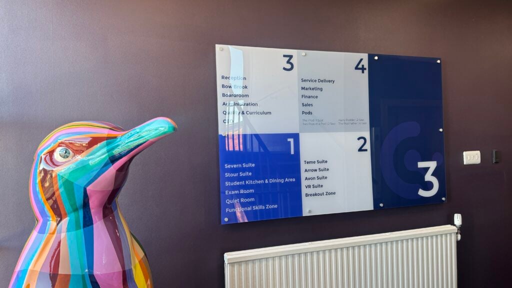
Good wayfinding should make navigating a building feel effortless. Visitors shouldn’t have to stop at every junction, hunt for room numbers or ask reception where they need to go.
Yet when you work in the same building every day, it’s easy to forget how confusing it might be to someone visiting for the first time. What feels obvious to you isn’t necessarily obvious to them.
From offices and schools to hospitals, hotels and manufacturing facilities, here are some of the most common internal wayfinding mistakes we see – and how to avoid them.
1. Designing for People Who Already Know the Building
This is probably the biggest mistake.
When you’re familiar with a building, you instinctively know that Marketing is upstairs, Meeting Room 3 is around the corner and the toilets are behind reception. A first-time visitor doesn’t.
When planning wayfinding signage, try walking through the building as though you’ve never been there before. Start at the entrance and identify every point where someone needs to make a decision.
These are the places your signage needs to work hardest.
2. Not Putting Signs Where Decisions Are Made
A directional sign isn’t much help once someone has already walked past the turning.
Effective wayfinding needs to anticipate the visitor’s next decision. Entrances, corridors, stairwells, lifts and junctions are all natural points for directional signage.
And don’t automatically look to the walls. Hanging signs, floor graphics and window graphics can sometimes be far more visible, particularly in busy or open-plan environments.
3. Trying to Say Too Much
More information doesn’t necessarily make navigation easier.
Overloading a directory or directional sign with departments, arrows, room numbers and additional messages can make it difficult to understand at a glance.
Keep information concise, use a clear hierarchy and group destinations logically. Someone walking through a building should be able to understand a sign in seconds rather than stopping to study it.
4. Forgetting About Consistency
If one floor uses arrows, another uses colours and another has completely different signage, visitors have to relearn the system as they move through the building.
A successful internal wayfinding system should have a consistent visual language. Fonts, colours, icons, arrows, terminology and sign styles should work together throughout the visitor journey.
Consistency doesn’t mean every sign has to look identical. Directories, door signs, wall graphics, suspended signs and floor graphics can all perform different jobs while still clearly belonging to the same branded system.
5. Forgetting the Final Sign
You’ve successfully guided someone across the building – but how do they know they’ve arrived?
This is an easily overlooked part of wayfinding. Clear door signs, room identification, department signage and reception signs provide confirmation at the end of the journey.
Without them, visitors can get within metres of their destination and still be unsure where they’re supposed to go.
6. Forgetting About Accessibility
Wayfinding needs to work for as many people as possible.
Colour contrast, font choice, text size, symbols, positioning and lighting can all affect how easily information can be understood. Depending on the environment, you may also need to consider tactile information, Braille and accessible routes.
Accessibility shouldn’t be something added at the end of the design process. It should form part of the wayfinding strategy from the beginning.
7. Never Reviewing Your Wayfinding
Buildings change.
Teams move, departments grow, rooms are repurposed and new entrances appear – but signage is often left exactly where it was.
Over time, this can result in outdated directions, temporary notices stuck over permanent signs and a wayfinding system that no longer reflects how people actually use the building.
One thing we’ve learnt is that if visitors regularly need to ask staff for directions, it’s probably time to review your signage.
Sometimes a few carefully considered changes are all that’s needed to make the entire visitor journey easier.
See Your Building Through Their Eyes
The best wayfinding systems aren’t necessarily the ones with the most signs. They’re the ones that provide the right information, in the right place, at the right time.
From directories and directional signage to hanging signs, door signs, wall graphics, window graphics and floor graphics, each element should work together to guide people naturally through your space.
At PB Signs, we design, manufacture and install bespoke internal wayfinding signage for workplaces, schools, manufacturing facilities, hospitality venues and public environments across the UK – helping organisations create spaces that are easier to understand from the very first visit.