
Worcester University- Pecking Order
THE CLIENT
The University of Worcester provides a range of food and drink facilities across its campuses for students, staff and visitors. For its latest hospitality concept, the University wanted to create Pecking Order – a fresh, distinctive food brand that would have its own personality while working effectively within the busy Student Union environment.
THE BRIEF
PB Signs was commissioned to designand develop the Pecking Order brand from the ground up, before bringing it to life across the physical food outlet.
The brief extended far beyond signage. The new concept needed a recognisable identity that could work across everything from the main serving area and interior graphics to promotional materials and future marketing.
OUR APPROACH
We began with the brand itself, developing the distinctive Pecking Order visual identity, including its colour palette, typography, graphic style and playful chicken-led creative.
Once established, we used this to ensure consistency across future print, signage and marketing applications.
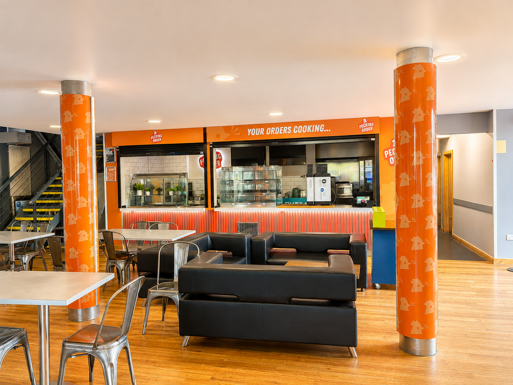
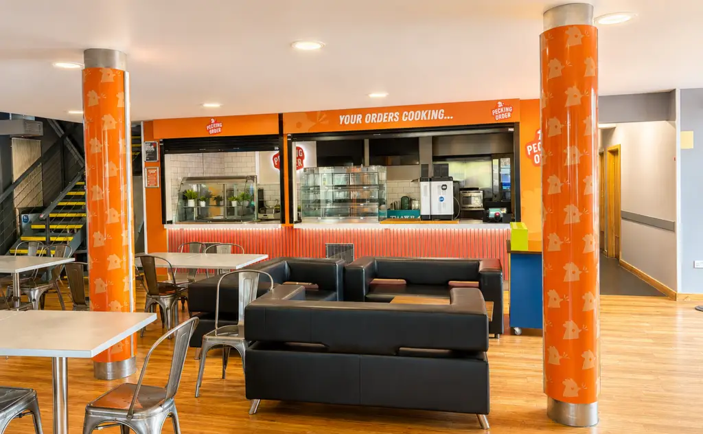
From there, our design and production teams translated the new identity into the physical environment, looking at how existing walls, worktops, counters and structural pillars could become part of the brand experience.
This joined-up approach meant the branding, signage, interior graphics and promotional print were developed as one cohesive project rather than as individual elements.
THE PROJECT
The complete project covered brand development, design, manufacture and installation, including:
- Pecking Order brand identity development and design
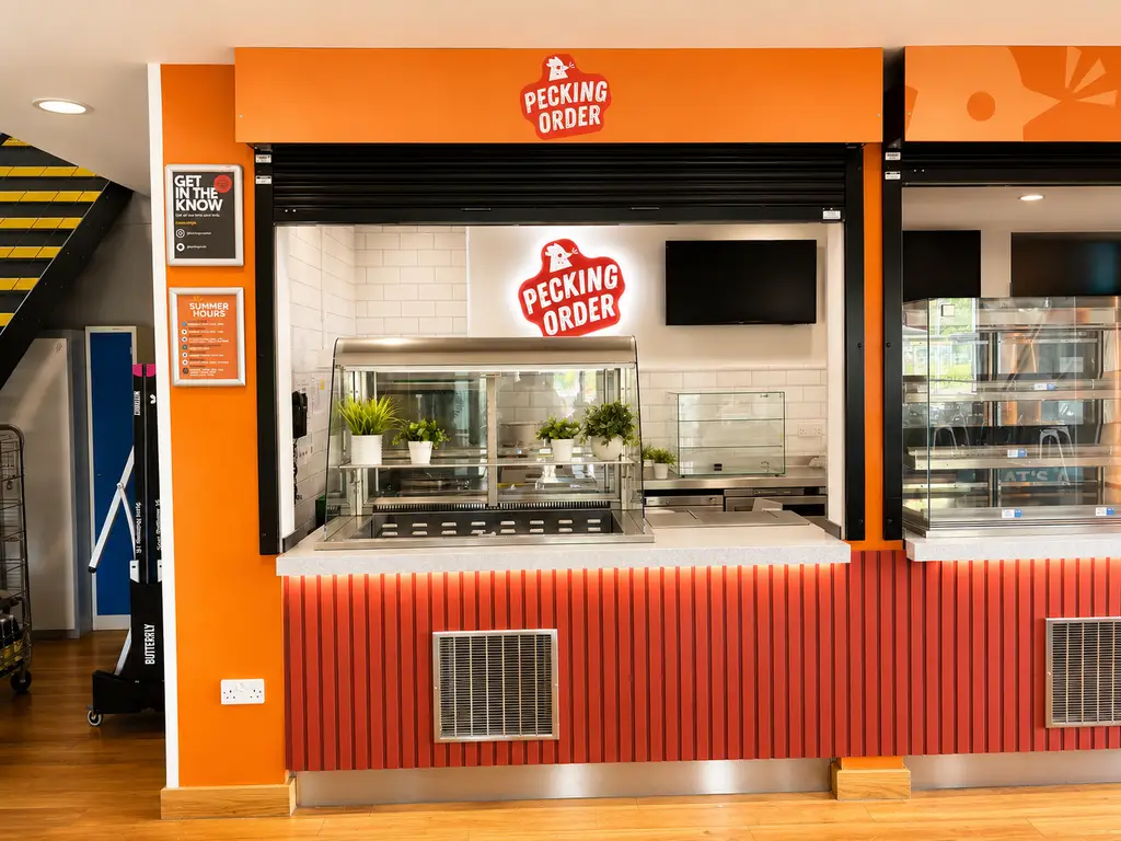
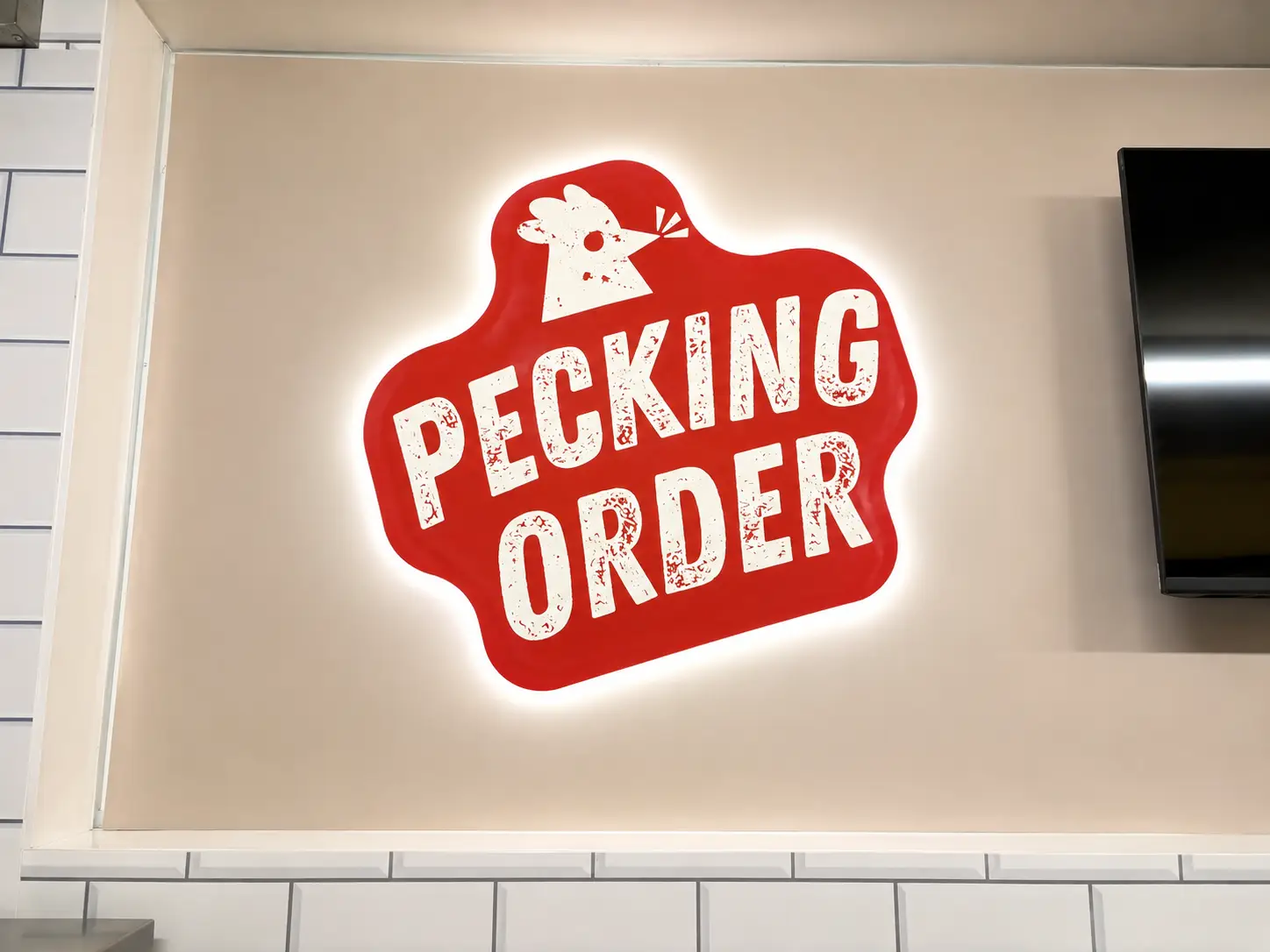
- Bespoke halo-lit acrylic signage
- Custom pillar wraps
- Kitchen worktop wrapping
- Kitchen and wall vinyl wraps
- Foamex counter and wall graphics
- Custom branded bunting
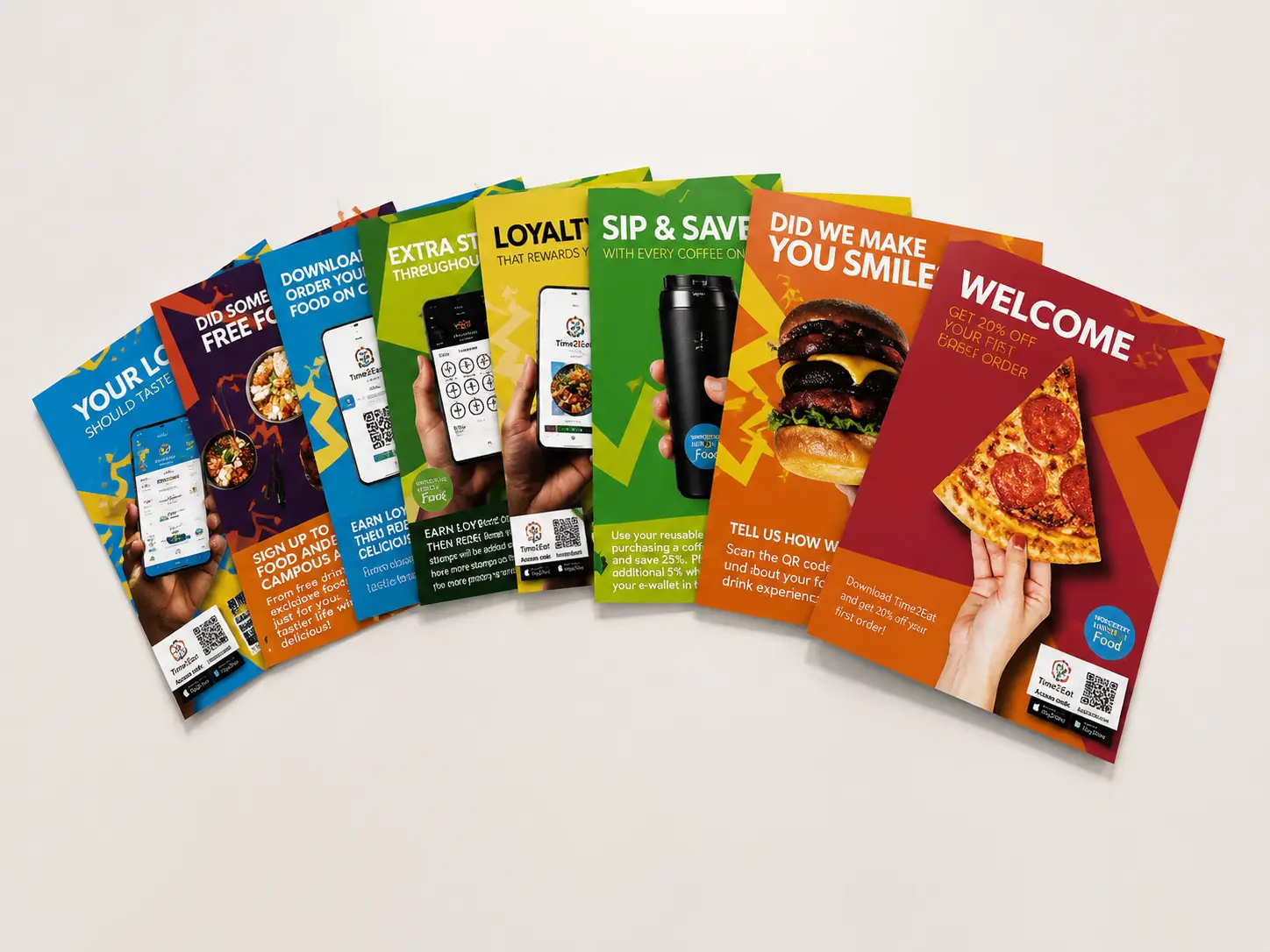
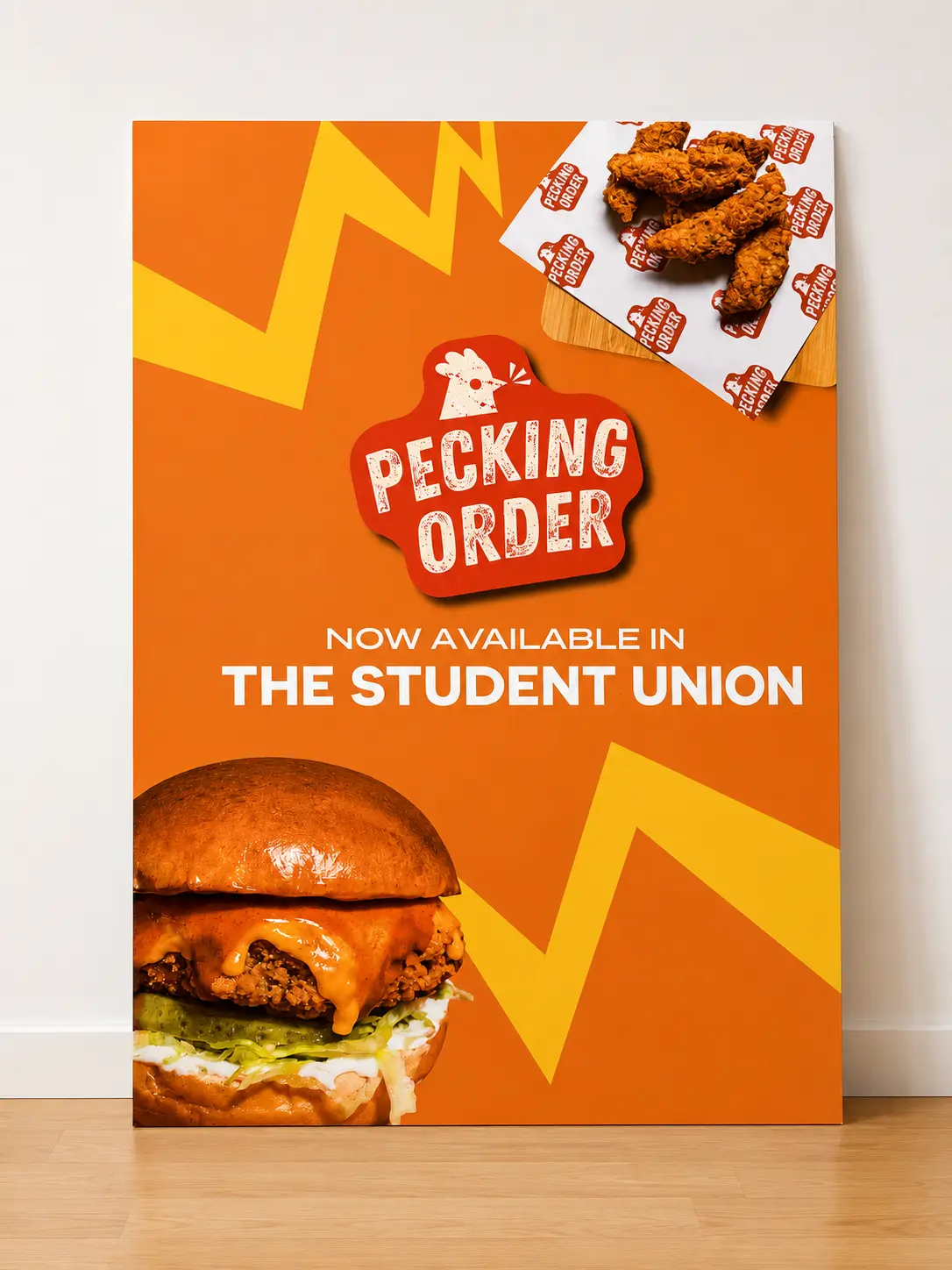
- Foamex promotional posters
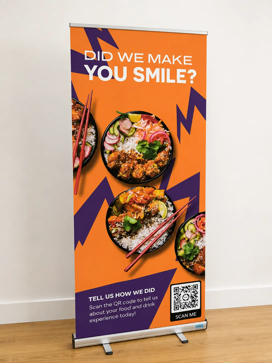
- Roller banners
THE SOLUTION
At the heart of the project is a bold new hospitality brand designed to work just as effectively on a small piece of promotional print as it does across an entire university food outlet.
The illuminated Pecking Order sign creates a strong focal point behind the counter, while vibrant pillar wraps, wall graphics and counter finishes carry the identity throughout the surrounding space.
Wrapping the existing kitchen walls and worktops also provided an effective way to dramatically change the appearance of the environment without unnecessarily replacing existing surfaces.
Supporting posters, roller banners and branded bunting then extended the identity into the wider campus, promoting offers, loyalty rewards, app ordering and customer feedback.
THE OUTCOME
The result is more than a signage installation – it’s a complete brand and environment created for the University of Worcester.
From developing the initial Pecking Order identity, through to manufacturing and installing the finished hospitality signage, surface wraps and promotional graphics, PB Signs provided one coordinated solution from concept through to completion.
The finished space is bold, energetic and immediately recognisable, giving Pecking Order its own personality within the Student Union while providing the University with a strong visual identity that can continue to be used across future marketing and applications.
The project is a great example of how schools, colleges and universities can combine brand development, education signage and hospitality design to transform cafés, canteens, food halls and student spaces into engaging, memorable environments.